


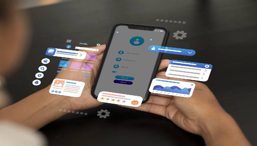
Mobile SEO is no longer a separate discipline from SEO — it is SEO. Google has operated a mobile-first index since 2023, meaning the mobile version of a page is the version Google crawls, indexes, and uses to determine rankings for all users, including desktop users. More than 75 percent of Indian internet searches occur on smartphones. A Gurgaon business with a website that performs poorly on mobile is underperforming in rankings for the vast majority of its potential audience. Garuda Technologies delivers mobile SEO optimisation covering Core Web Vitals on mobile, mobile-first indexing compliance, touch usability, mobile content parity, and mobile-specific keyword targeting — addressing the full spectrum of signals that determine mobile search performance.
India's mobile internet user base exceeded 900 million in 2026. Mobile search accounts for the majority of queries across every industry category — B2B, B2C, healthcare, ecommerce, and local services. Three specific facts about Indian mobile search behaviour shape why mobile SEO must be treated as the primary SEO investment rather than an add-on:
Mobile SEO Fact | Why It Matters for Rankings |
75%+ of Indian searches happen on mobile | Google's mobile-first index uses mobile performance scores for all ranking decisions. A site scoring 85 on desktop Core Web Vitals and 42 on mobile is ranked by its mobile score of 42. |
India has the world's second-largest mobile internet market | The scale of Indian mobile search means even moderate improvements in mobile rankings produce substantial traffic increases. A position 3 to position 1 move on a mobile-targeted query can add thousands of monthly visitors. |
4G and 5G connectivity variance across India | While urban centres like Gurgaon, Delhi, and Bangalore have strong 4G/5G coverage, significant portions of the Indian audience access the web on slower connections. Pages not optimised for bandwidth efficiency lose users before they load. |
Google's INP metric disproportionately fails Indian mobile sites | Interaction to Next Paint — the responsiveness metric introduced in 2024 — fails most frequently on mobile due to JavaScript-heavy pages with poor thread management. Indian websites built on heavy WordPress themes consistently fail INP on mobile. |
Mobile-first indexing means Google uses the mobile version of your website — the version rendered on a smartphone browser — as the basis for indexing and ranking. If your mobile page has less content than your desktop page, Google indexes the reduced mobile content. If your mobile page lacks schema markup that exists on the desktop version, Google does not see that schema. If your mobile navigation hides pages that desktop navigation links to, Google may not discover those pages at all.
Audit Area | What Is Checked and Why |
Content parity | All body text, headings, images, and structured data present on desktop must also be present and accessible on the mobile version. Hidden or collapsed content (in tabs, accordions, or JavaScript-triggered elements) is indexed with lower weight on mobile than fully visible desktop content. |
Structured data parity | Schema markup on desktop pages must be replicated on mobile pages. Sites that add schema via desktop-only scripts or plugins — without confirming mobile rendering — have schema-invisible mobile pages. Google Search Console's Rich Results Test identifies this gap. |
Navigation parity | Mobile navigation menus that hide pages accessible on desktop create crawl gaps. If a service page is only accessible through a desktop mega-menu that collapses to a hamburger menu with fewer links on mobile, Google may not discover that service page during its mobile crawl. |
Image and media parity | Images that load on desktop but not on mobile due to CSS display:none rules, lazy loading failures, or mobile-specific layout changes are not indexed. All images contributing to on-page content relevance must load and render on mobile. |
Google uses field data from real Chrome users on mobile devices — collected in the Chrome User Experience Report (CrUX) — as the performance signals for its Page Experience ranking component. Lab data from PageSpeed Insights is useful for diagnosis, but CrUX field data is what actually influences rankings.
LCP on mobile is more difficult to achieve than on desktop because mobile devices have slower processors, lower memory, and variable network connectivity. The most common mobile LCP failure causes for Indian business websites: hero images above 500KB served without WebP compression, server response times above 800ms from hosting providers without Indian or Singapore CDN nodes, render-blocking scripts loading before content, and Google Fonts loading without font-display: swap causing blank text during load. For Gurgaon IT company websites hosted on shared hosting with US-based servers, network latency alone can add 300 to 600ms to mobile LCP.
INP measures how quickly a page responds to user interactions throughout the session — clicks, taps, form inputs. Mobile INP failures are more severe than desktop failures because mobile processors execute JavaScript more slowly than desktop processors. A 300ms desktop INP may produce a 600ms mobile INP on the same page. The most common mobile INP failure causes: third-party scripts (chat widgets, analytics, advertising pixels) blocking the main thread during user interactions, unoptimised React or Vue component re-renders, and large JavaScript bundles that delay interaction response on low-end devices.
CLS failures on mobile are more visible and more disruptive than on desktop because the smaller screen means any layout shift moves a larger proportion of visible content. The most common mobile CLS causes: ad units loading without reserved space, web fonts rendering and changing text size, and cookie consent banners pushing content down on load. Mobile CLS failures directly harm user experience — a user tapping a link on mobile that shifts position before the tap registers clicks the wrong element. Google's CrUX data captures these interactions and reflects them in mobile CLS scores.
Mobile SEO Failure | Impact and Fix |
Desktop-only schema markup | Schema implemented via WordPress plugins that only render on desktop. Mobile pages have no structured data, losing rich result eligibility and AI Overview citation probability. |
Uncompressed images served to mobile | Full-resolution desktop images (1920px wide, 800KB+) delivered to a 375px mobile screen. Mobile browsers download the full image regardless of display size. WebP format and srcset responsive images reduce mobile image weight by 40 to 70 percent. |
Viewport configuration errors | Missing or incorrect viewport meta tag. Without <meta name='viewport' content='width=device-width, initial-scale=1'>, pages render at desktop width on mobile, requiring horizontal scrolling. Google flags this as a mobile usability error in Search Console. |
Touch targets too small | Buttons and links under 48px in height or with less than 8px spacing between adjacent targets. Google's mobile usability report flags tap targets that are too small to reliably activate on a touchscreen, and this is reflected in mobile UX scoring. |
Intrusive interstitials on mobile | Pop-ups, cookie consent banners, or newsletter overlays that cover the main content on mobile immediately after page load. Google's mobile interstitials policy penalises pages where the main content is not immediately accessible on a mobile device. |
Content blocked by CSS on mobile | Text or sections hidden with CSS display:none on mobile for layout reasons. If that content contains target keywords or schema markup, Google's mobile-first indexer does not process it, reducing the page's topical relevance for those terms. |
Voice search in India has grown significantly as affordable smartphones and smart speakers have become mainstream. Indian voice queries differ from typed queries in three specific ways that affect keyword strategy: they are longer and more conversational ('which is the best SEO company in Gurgaon for IT firms' rather than 'SEO company Gurgaon'), they more frequently include regional geographic qualifiers, and a growing proportion occur in Hindi and regional languages rather than English. Optimising for voice search requires question-based content with direct answer-first structures, FAQ schema, and conversational long-tail keyword targets — the same content architecture that benefits AI Overview optimisation.
Google uses mobile performance data from its mobile-first index for ranking decisions. This applies to all search results — not just mobile search results. A business whose website performs well on desktop but poorly on mobile is ranked by its mobile performance across all Google searches, including those conducted on desktop computers. The mobile Core Web Vitals scores drawn from Chrome User Experience Report field data are the specific performance signals that feed into Google's Page Experience ranking component.
The three highest-impact mobile LCP improvements, ranked by implementation speed and typical impact: first, convert all hero and above-the-fold images to WebP format and add explicit width and height attributes — this can reduce LCP by 0.5 to 1.5 seconds on image-heavy pages. Second, move hosting to a provider with India or Singapore server locations, or add a CDN with Indian edge nodes (Cloudflare, BunnyCDN, or AWS CloudFront with Mumbai region) — this reduces server response time by 200 to 600ms for Indian mobile users. Third, defer non-critical JavaScript and move render-blocking scripts below the fold — this allows the browser to begin rendering page content before executing third-party scripts.
Responsive design — one HTML file that adjusts layout via CSS for different screen sizes — is the recommended and sufficient approach for most business websites. It is simpler to maintain, consolidates link equity under one URL, and avoids the canonical complexity required by separate mobile subdomains (m.example.com). Separate mobile websites only make sense for high-traffic ecommerce stores with extremely different content or feature sets for mobile users — and even then, responsive progressive web apps have largely replaced separate mobile sites as the preferred implementation. Google explicitly recommends responsive design for mobile-first indexing compliance.
Mobile SEO and standard SEO share the same foundational requirements — technical health, on-page optimisation, content quality, and backlinks — but mobile SEO adds three specific requirement layers. First, content parity: mobile pages must contain all the same content, headings, and structured data as desktop pages. Second, mobile Core Web Vitals: LCP, INP, and CLS must pass thresholds specifically on mobile devices using field data from real mobile users. Third, mobile usability: viewport configuration, touch target sizing, intrusive interstitial avoidance, and mobile navigation completeness are all mobile-specific requirements that do not apply to desktop pages.

Garuda Technologies - Copyright . All rights reserved.
Garuda Technologies is a Gurgaon-headquartered technology and travel services company operating from Udyog Vihar, Sector 19 — the heart of Gurugram's IT and industrial corridor. Founded with the conviction that businesses deserve a single accountable partner for their digital and travel needs, Garuda Technologies operates two integrated verticals: a full-spectrum IT and digital services division, and a travel services division powered by seven specialized travel brands.